

Abbi has decided to showcase all the FINALISTS and give you the credit you desire for making the final decision so hard 😅
Each finalist has Abbi's PERSONAL feedback to why each entry was in the running to be the overall winner!
Keep yours eye on Abbi's INSTAGRAM for the reveal of the Winner from the Competition very soon!
Thank you for your incredible support and time creating these AMAZING designs 🎨
I loved the abstract feel of the design and it looked so different from my normal design - with a subtle and clever tribute to Silverstone itself with the colours.
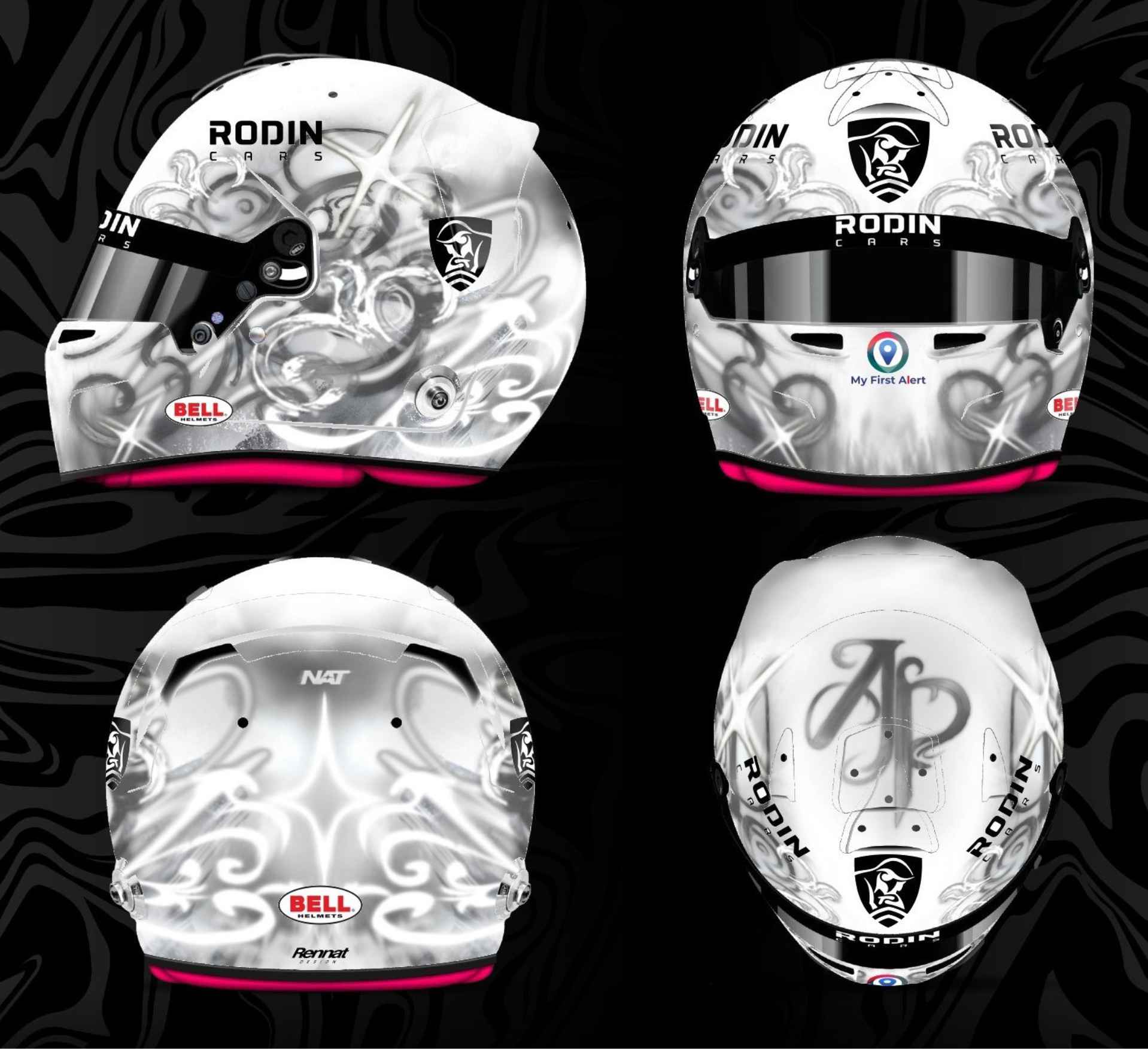
The background elements, how well the colours blend with each other and the detail in the design is amazing! You can really see how much time went into every element.
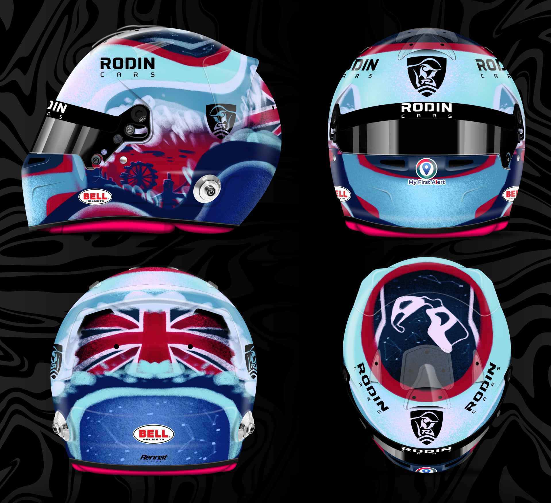
I loved the way how this design is such a creative take on splitting the design sections, alongside using the ribbon to form the AP, First Woman and Silverstone Circuit was brilliant!
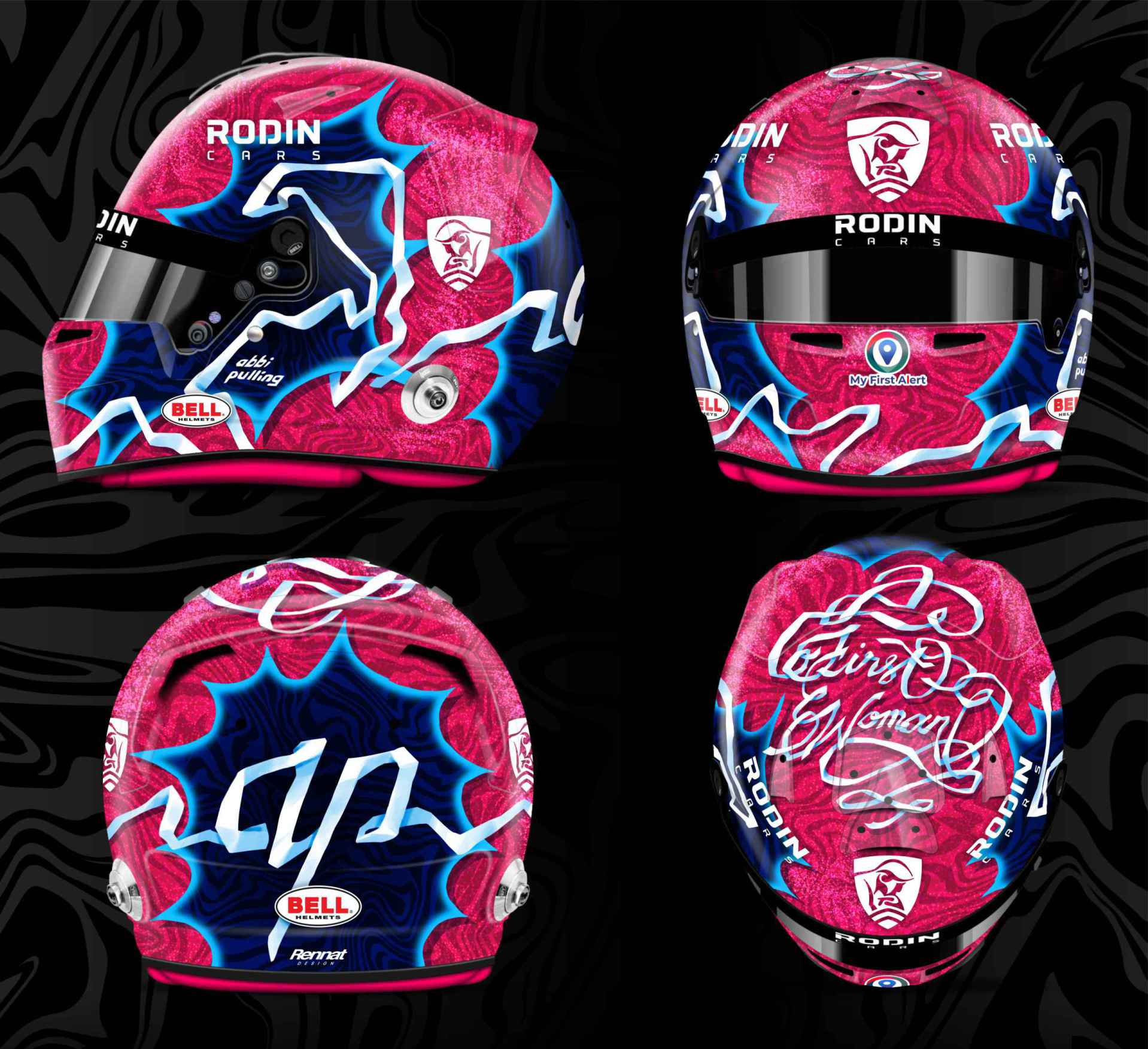
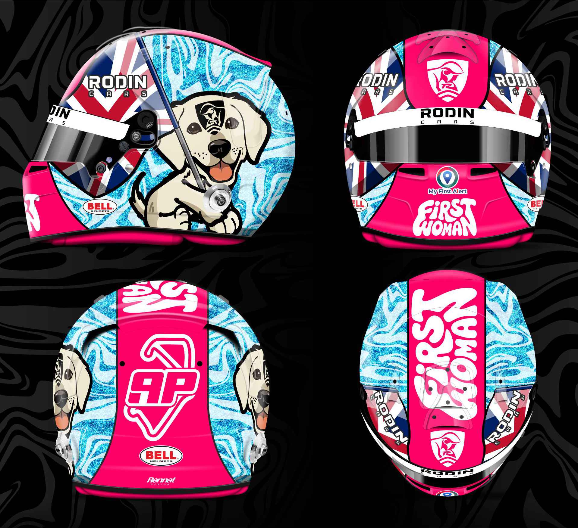
i loved the combination of pinks with the union jack, and especially the detail in the rear design and the red arrows across the top of the design.
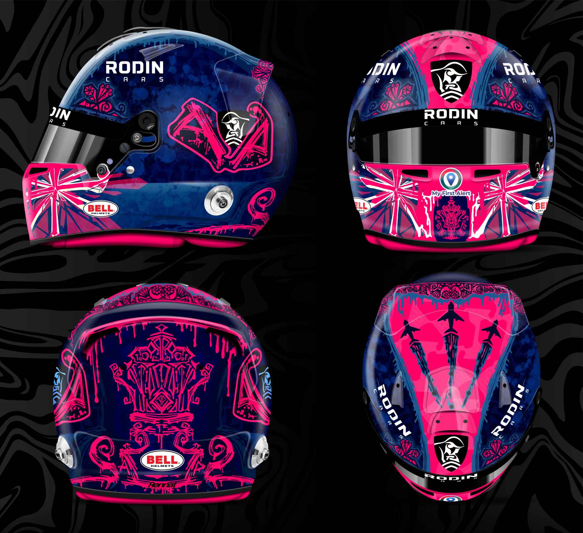
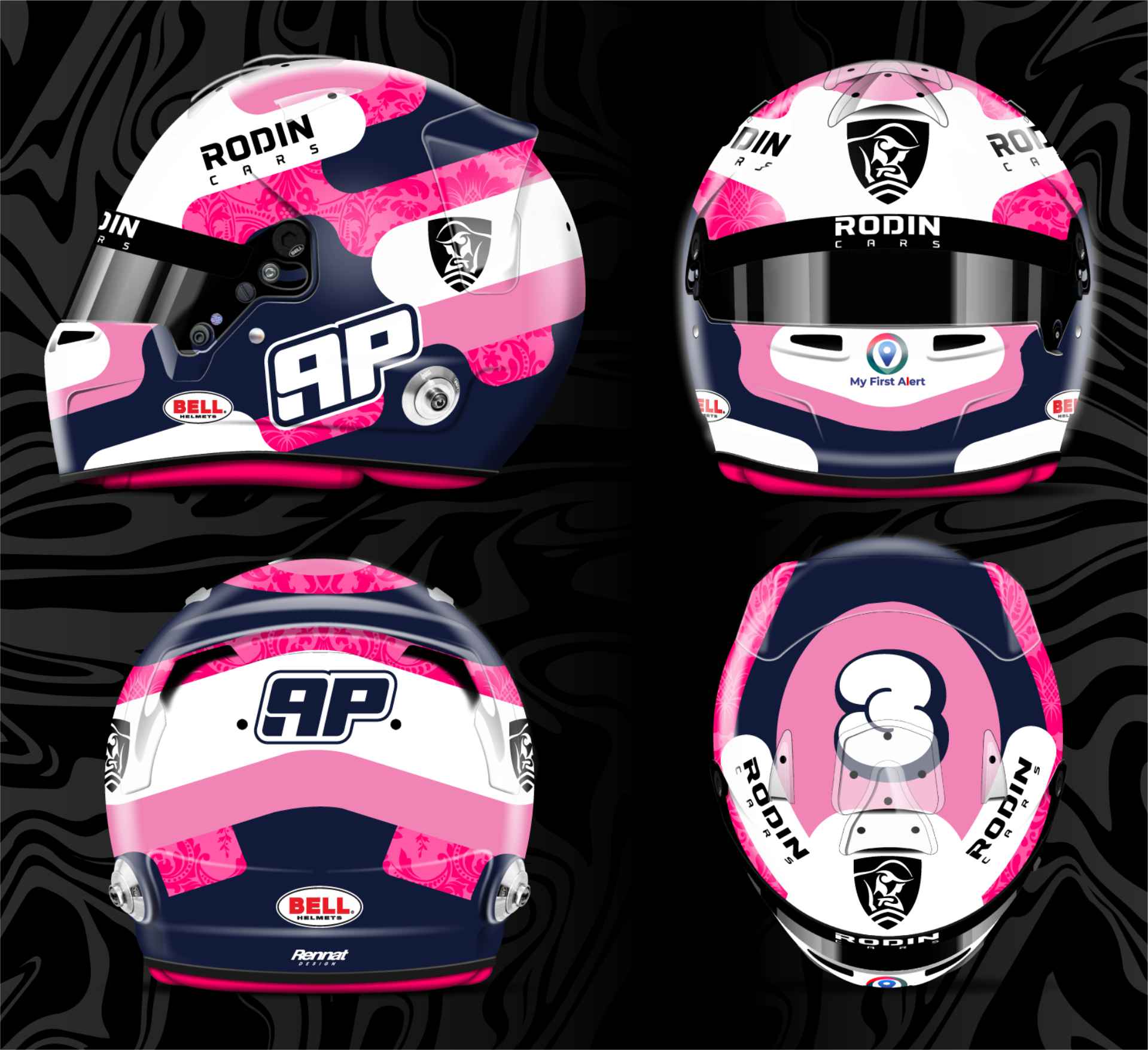
This design was actually created by two members of my team who help run my Store and Fanzone! They were actually disqualified for this but I hope you like the design :)
I love how it combines my first painted helmet, along with the helmet I used to win my 2 British Karting titles - which even included recreatring the background detail.
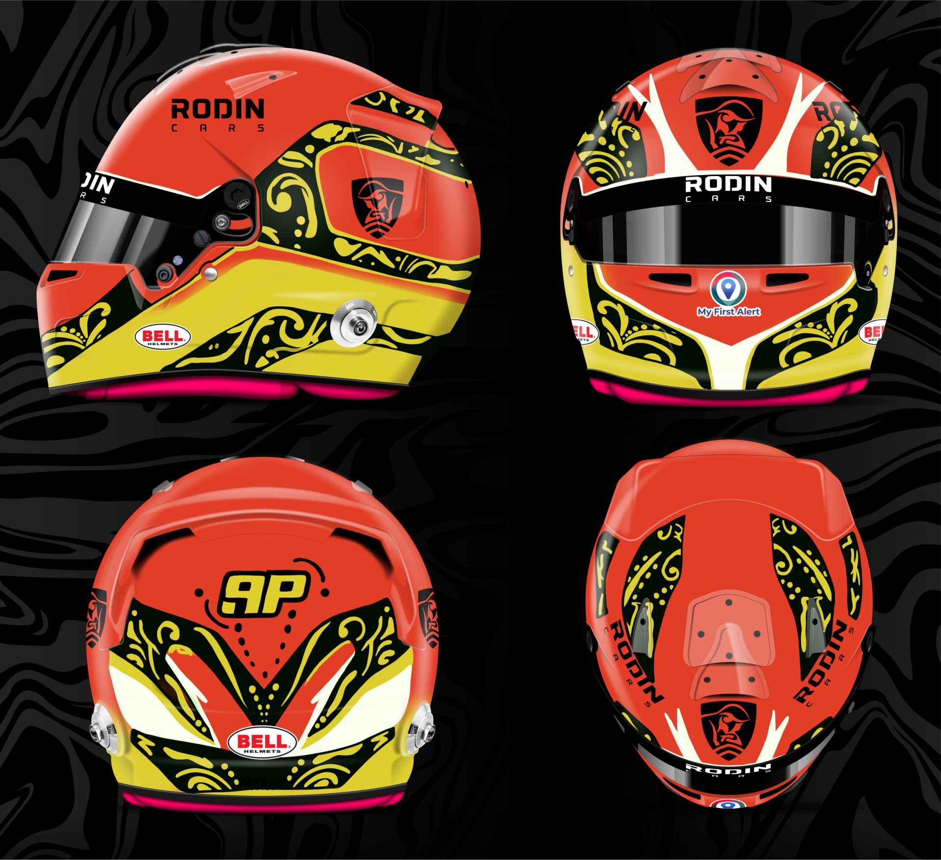
It combines a range of colours that blend super well, drawings of Herbie and features a unique colour palette that you don't see on many helmets!
The pink twist on the union jack colourscheme really makes this clean and sharp - which would be hard to miss even from a distance.
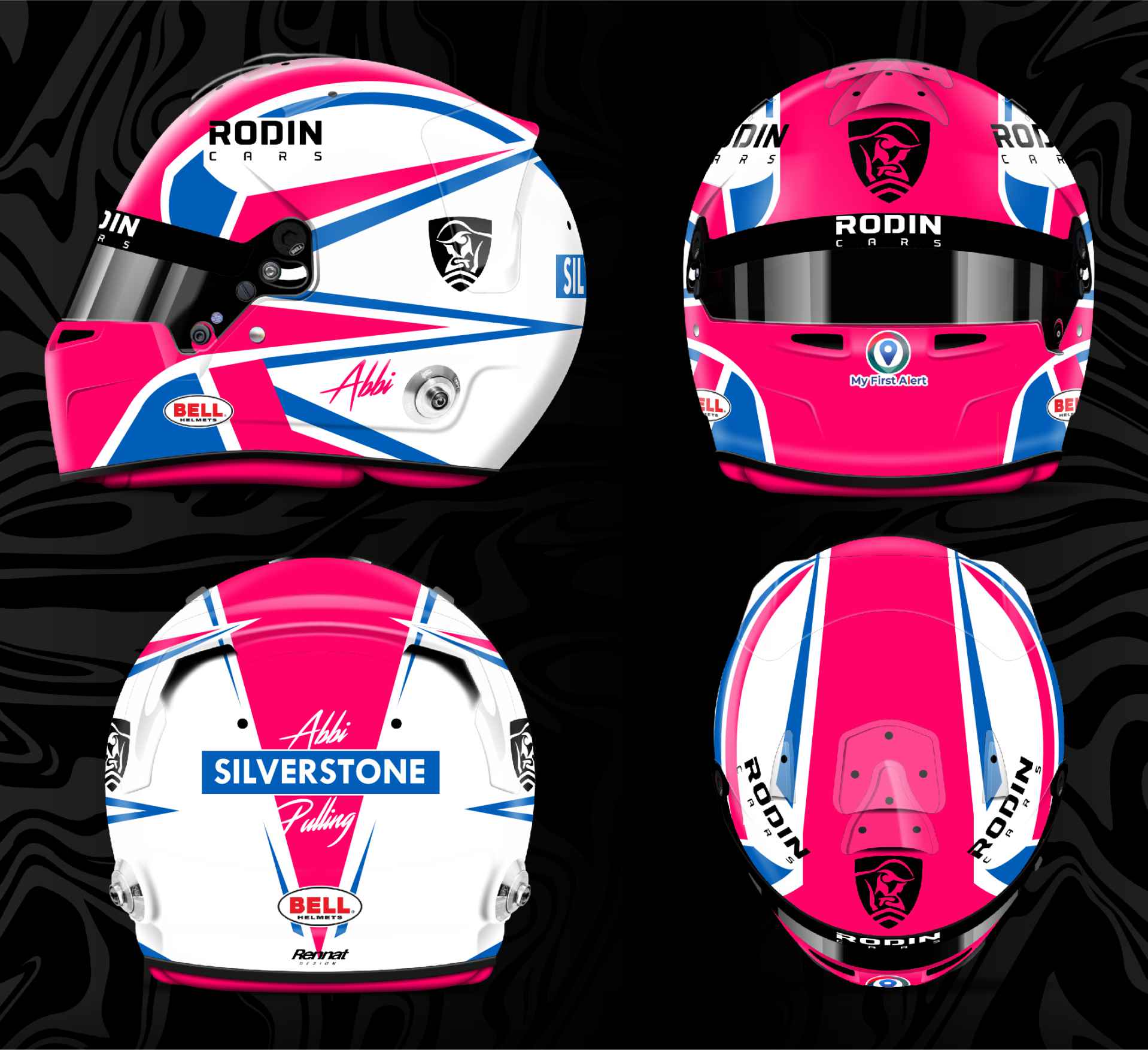
Every colours blends together so well and the elements really flow into each other beautifully in this entrant!
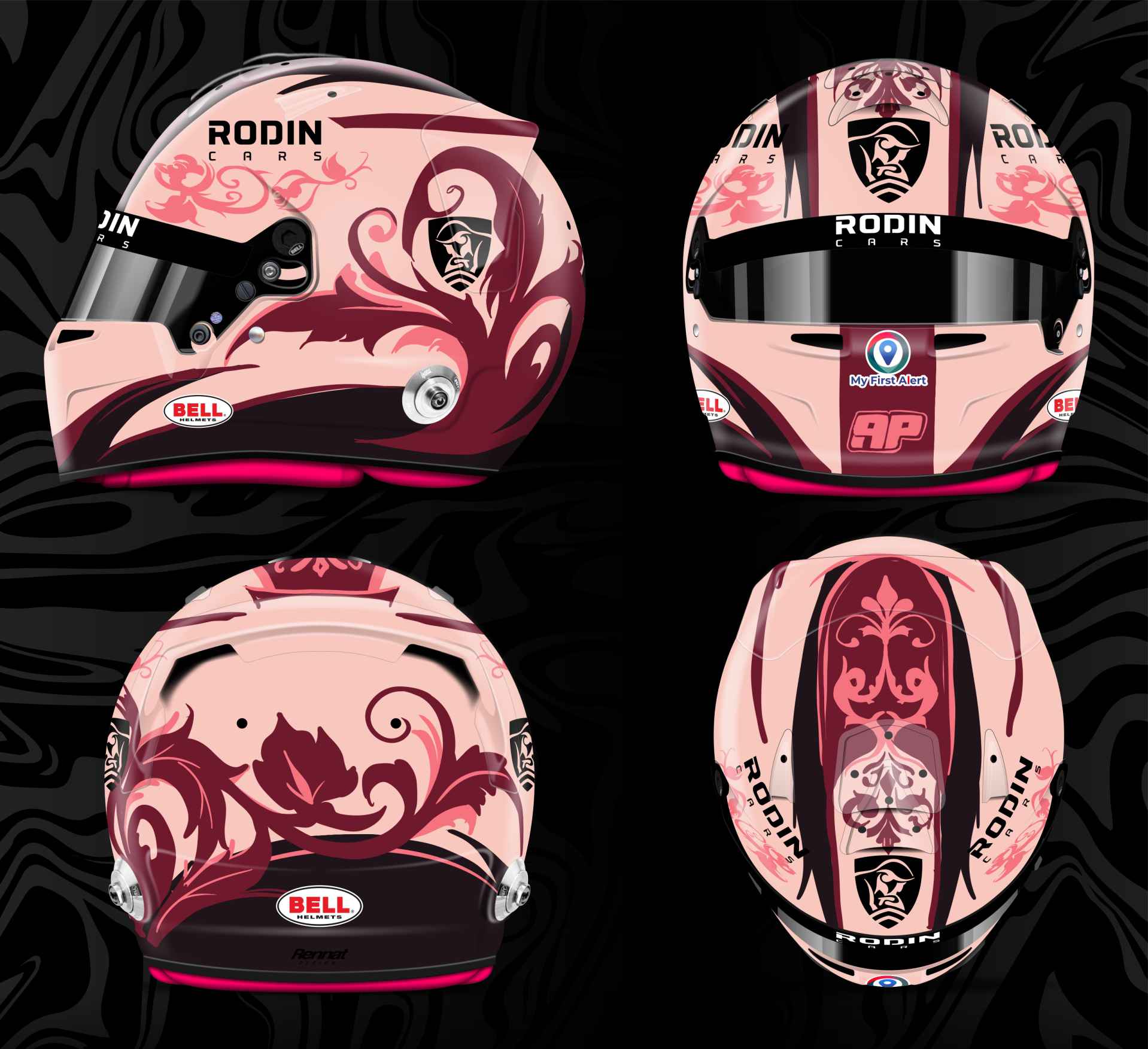
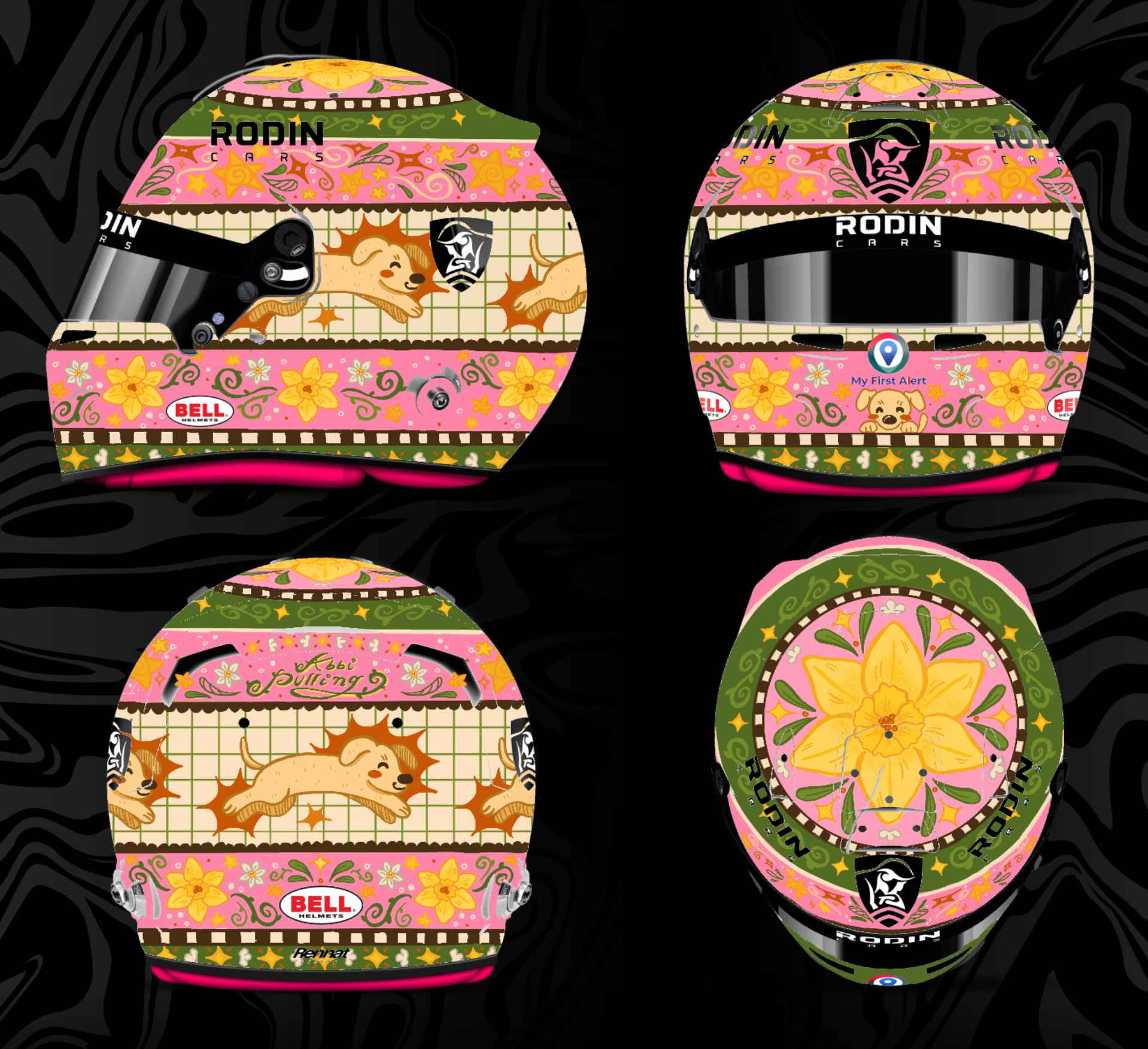
This reminds me a lot of the sort of themes I have been experimenting with in my merchandise and the background details really bring it all together!


.svg)


.svg)